00:00:05.899
Thank you so much for tuning in to watch this talk, and thank you to RailsConf for having me. This is actually the very first conference I've ever spoken at, so I am thrilled to be able to share something that's very close to my heart with the Rails community.
00:00:11.940
A little bit about myself: my name is Ryan. I am a second-career developer from Fort Worth, Texas. Some of the things I love about Texas are summed up in one image: the food. If you're ever in Texas, I highly recommend the barbecue—it's pretty hard to find bad barbecue. We also have some great Mexican food, so definitely check that out.
00:00:26.640
Additionally, this is the state where I met my wife. Here’s a picture of us in high school. I have a very intense look on my face here. Let me put up a recent picture. Clearly, we have matured. I mentioned I am a second-career developer; my first career was as a designer, and I was a designer for 15 years. Those 15 years can be summed up in one image that reflects that experience.
00:01:00.840
Fortunately, I eventually made the jump to development, and now I help work on the e-commerce website for The Container Store. One of my passions is front-end development, which I absolutely love. It's one of the first layers that users encounter on the web, and a big part of front-end development is ensuring that the UI we build is accessible and can be used by everyone.
00:01:40.680
To learn more about accessibility, our team invited a special needs teacher to share how her students use accessible technology on the web. I’ve been building websites for a long time—longer than I’ve been at The Container Store—so I thought I knew how to build accessible UI. However, after her presentation, I realized how uninformed I truly was, and that realization led to this talk.
00:02:05.399
Before I go any further, I want to clarify that this isn’t strictly a Rails talk, but it is Rails-adjacent. This talk is about an idea that Sir Tim Berners-Lee had when he invented the web 30 years ago: to create a community that openly and freely shared knowledge that anyone could access. Unfortunately, a lot of the content on the web now is inaccessible, and it's getting worse.
00:02:54.600
WebAIM, a non-profit organization specializing in web accessibility, conducts yearly surveys of the top one million home pages. In last year's survey, they found almost 61 million accessibility errors, which is up 1.2 percent from the previous year. It's important to note that this survey utilized automated accessibility testing, which doesn’t catch all the errors. Therefore, the picture is probably much worse than it seems.
00:03:37.580
I want to talk about how we as developers can help solve this crisis. First, let's clarify what I mean when I say 'accessibility.' Simply put, accessibility is about removing obstacles to ensure everyone has equal opportunity to participate. This is an essential concept: building websites, applications, tools, and technologies in a way that allows everyone to participate and contribute equally.
00:04:39.180
If you build anything for the web, this should matter to you. It should matter because, first and foremost, it's the law in the U.S. The Americans with Disabilities Act (ADA) prohibits discrimination based on disability. Even though the Act was passed before the widespread adoption of the internet, websites have been declared subject to the ADA as places of public accommodations. Other countries have also passed similar laws.
00:05:21.720
This past year, we've seen people increasingly rely on the internet to get things done. Consequently, we're witnessing a rise in ADA-related digital lawsuits. There were 3,550 new ADA lawsuits in 2020, which is up 23 percent from the previous year. You can clearly see the trend here.
00:06:01.440
Accessibility also matters because it can benefit your business. The CDC estimates that 61 million Americans—that's one in four U.S. adults—have a disability that impacts their major life activities. The Nielsen Company defines this group as one of the most present but perhaps most overlooked segments of the U.S. consumer market, with over $490 billion in disposable income.
00:06:37.860
Therefore, it's critical to cater to this community—it can actually become a unique marketing opportunity. Another reason accessibility matters is that it improves things for everyone. A perfect example is curb cuts, which were originally introduced in Berkeley to allow wheelchair users to cross the street without assistance. However, these cuts also benefit parents with strollers, travelers with luggage, and children on skateboards and scooters.
00:07:08.760
Accessibility on the web similarly benefits all users. The more accessible you make your website or application, the easier it is for everyone to use. This consideration is especially important when you think about what users could be experiencing while using your app or site. Temporary disabilities, like broken limbs or noise distractions, alongside age-related usability declines, can pose significant challenges.
00:07:42.840
Finally, accessibility matters because it is an essential right. We have an ethical responsibility to ensure all content is available to as many people as possible. This was the original vision for the web. So now you know that accessibility matters, but perhaps like me, you were once completely unaware of common accessibility issues and didn’t know where to start.
00:08:23.220
So, I ended up at the Web Content Accessibility Guidelines (WCAG) for short. It was created with the goal of standardizing web content accessibility, and it’s about to be expanded to include accessibility for all digital content when it changes to version 3.0. The current version, 2.1, has three levels of compliance: Level A, which is the basic accessibility tier; Level AA, which is considered the legal requirements; and Level AAA, the gold standard.
00:09:07.740
WCAG also employs four guiding principles to define accessible content: perceivable, operable, understandable, and robust. A convenient way to remember these principles is through the acronym POUR. Let's take a look at POUR content in action.
00:09:53.820
The first principle is perceivable, which means that content should be able to be recognized by any of the available senses. That means anything displayed on the screen must not only be seen but also heard and even felt if necessary—more on that later. A common example of this issue arises with improper color contrast, which is one of the most common—and arguably the easiest to fix—accessibility errors.
00:10:50.640
In this example displayed in Chrome, we see two different blocks of text: one is smaller and one is larger. Inspecting this using Chrome DevTools shows a color swatch that we can click. Here, the contrast ratio is 2.59. This means it's only 2.59 times darker than its background, but it needs to be at least 4.5 times darker. To address this, we can drag the color indicator just below the Level AA line, and now we've resolved the issue.
00:11:28.320
Now, let's inspect the larger text. The color contrast ratio is again showing as 2.59, but since this is larger text, we only need a contrast ratio of 3.0. We can select a suggested color swatch to achieve compliance. Always remember to check with a designer on color contrast, as ideally, these considerations should have already been integrated into the design.
00:12:15.960
As I mentioned earlier, content should be able to be heard and even felt. One of the main functions of accessible technology is to transform one type of content into another. For example, screen readers transform text into audio content, while Braille displays transform text into content that can be felt. We even have software capable of automatically transforming audio content into captions.
00:12:53.160
However, these technologies often still require enhancement. For the next few examples, I will be using VoiceOver, the screen reader that comes with macOS, along with the Safari web browser. In this demonstration, we turned on VoiceOver, which communicates information such as which application we’re on and the name of the window, as well as what currently has keyboard focus.
00:13:31.800
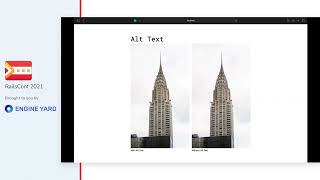
For example, after focusing on an image, the screen reader states that we are currently on an image and provides a description. The screen reader obtains the context of the image from the provided alt text. Alt text is a short description that explains what the image is. It is crucial to include an ALT attribute with your images because failing to do so can confuse screen readers.
00:14:17.880
If your image is purely decorative and you don't want it to be announced by a screen reader, you can use a blank alt attribute. In fact, it might be beneficial to use background images for these types of images so they aren't read by the screen reader at all.
00:15:02.520
Let's also take a look at icon buttons. Screen readers can announce button labels if they have text inside, but what if they contain only icons? For instance, if there is a button with only a hamburger menu icon, it’s important to ensure that a label is associated with it to inform screen reader users what the button does.
00:15:47.640
In our example, we see that there is a label associated with the button, and it reads as 'navigation menu.' This is achieved by adding a visibly hidden label using the class SR-only, which hides the text visually but still allows it to be accessed by the screen reader. We must also ensure to set the SVG elements to not be focusable, as they are generally not interactive.
00:16:30.540
Now that we ensured our content is perceivable, we need to make sure it is operable. This means users should be able to interact with content in various ways. We need to support different inputs such as mouse, keyboard, touch, and voice, in addition to various contexts like desktops with magnification software or mobile devices.
00:17:16.440
Full keyboard support is critical to accommodating the widest variety of devices. The Ruby on Rails repository on GitHub provides an excellent example of this, as it implements robust keyboard navigation features. When navigating with a keyboard, you can see the first element that appears is a skip to content link, which allows users to bypass unnecessary content.
00:18:09.900
After activating the skip to content link, I can navigate directly to the main content, thus streamlining the user experience, especially if there’s considerable content in the header. It’s vital to maintain focus styles when tabbing through content, as they indicate where you are on the page.
00:18:59.820
Many designers may wish to remove focus styles for aesthetic reasons, which can lead to confusion for users. It’s acceptable to restyle focus styles as long as they remain accessible. Creating accessible web content is about giving users options, and screen reader users often have multiple methods for quickly navigating through content.
00:19:34.560
In this demo, I’m going to show a feature called the rotor, which is akin to a command center for screen reader users. It is a collection of menus that allows users to quickly jump to various content types, such as links or headings, making navigation through a page more efficient.
00:20:20.520
For instance, when navigating the links menu, I can quickly cycle through and determine what links are present on the page. This makes it easier for users to interact with significant amounts of content without getting bogged down. Similarly, headings greatly aid navigation by breaking up content for clarity.
00:21:34.920
One of the most popular ways screen reader users navigate a page is through headings, which helps break up content for clarity. They’re also incredibly effective for navigating complex pages. For example, using the heading menu, I can quickly find the beginning of the Rails Getting Started section.
00:22:40.440
Custom UI elements must also be usable via the keyboard. For instance, a disclosure menu consists of a button and a hidden panel. When tabbing to the button, users should be able to use keys like return or space to open or close it, while also being able to tab through the menu content and close it using the escape key.
00:23:23.520
These keyboard interactions follow the Accessible Rich Internet Applications (ARIA) specification. The ARIA Authoring Practices provide excellent documentation for building accessible UI patterns, such as accordions or tabs, making it easier for developers to create accessible components.
00:23:55.740
Ensuring that our content is understandable is the next step. Declaring the page language through the lang attribute on the HTML element helps create clarity. This ensures that screen readers know what language they are parsing. Furthermore, surrounding any differing languages with the appropriate lang attributes offers additional context.
00:24:38.520
Another important aspect of making content understandable is providing clear error messages. For example, if I submit a form without entering any data, immediate feedback alerts me that my email is required. As I correct my input, the screen reader communicates the status of my input and any errors that arise.
00:25:11.880
Screen readers need assistance in linking labels and messages to form inputs. Buttons are straightforward, as they're marked with the button element's children, but inputs can be more complicated. Using semantic HTML elements such as the label element and ARIA `describedby` attributes greatly aids screen readers in conveying status and error messages effectively.
00:25:56.520
Finally, to maintain accessibility, content must be robust. Robust content should remain accessible across diverse technologies and contexts, which is best ensured by writing valid HTML. HTML validators, such as those from W3C, can help ensure your markup adheres to standards, thereby preventing significant accessibility bugs.
00:26:38.640
Additionally, ensuring that your markup correctly defines roles and relationships is crucial. Using semantic markup is vital, as there are numerous HTML elements with predefined roles. While it's possible to assign meaning to generic elements like <div> or <span>, it's more effective to use semantically meaningful elements from the outset.
00:27:15.840
One example is a disclosure menu. Creating an accessible version can involve specific native elements like <details> and <summary>, which offer built-in toggling functionality without necessitating extraneous JavaScript. As elements grow in complexity, adhering to semantic markup becomes increasingly beneficial.
00:28:03.960
It’s important to notify screen readers about changes in dynamic applications, like those often used in single-page applications. For example, updating a shopping cart icon should inform screen readers of the changes occurring on the page, ensuring accessibility remains intact.
00:28:51.300
As we’ve discussed, WCAG 2A provides minimum requirements, but merely meeting a specification doesn't guarantee accessibility. To thoroughly confirm that your content is accessible, manual testing with actual users who utilize assistive technology is the most reliable method. Companies like Fable Tech Labs specialize in this type of testing.
00:29:37.680
At this point, you may feel like we've covered so much that it seems overwhelming. Let’s go over a few strategies to keep from feeling discouraged. One of the most effective approaches is through automation. Automated testing can assist in identifying and preventing bugs while maintaining UI accessibility.
00:30:27.000
Integrating automated testing into your Continuous Integration/Continuous Deployment (CI/CD) pipeline provides real-time metrics. Focus on avoiding the addition of new violations with every commit and aim to reduce existing violations. Various tools, such as Cypress for end-to-end testing and AX core for accessibility audits, can significantly aid this process.
00:31:12.600
Web components represent an advanced way of structuring your UI, allowing you to encapsulate functionality and markup into custom elements. It's essential to leverage these technologies and methodologies to improve accessibility in your UI components. Additionally, the Rails community has developed practices utilizing partials to create composable components for better accessibility outcomes.
00:31:58.440
As you develop your components, remember to perform manual testing using browser accessibility extensions. I highly recommend AxCore DevTools, a Chrome plugin that can detect a variety of accessibility errors right out of the box. Always ensure your interfaces can be navigated effectively without a mouse, as this is a key indicator of accessibility.
00:32:41.340
Consider familiarizing yourself with screen readers. While they can feel intimidating at first, they are invaluable for gaining a new perspective on your UI. Both NVDA for Windows and VoiceOver for macOS are excellent options to explore. Finally, work to incorporate accessibility considerations as early as possible in the development process.
00:33:42.780
This means thinking about accessibility during the design phase, while writing feature requirements, and even during the hiring process. The earlier your organization addresses accessibility, the smoother it will seem.
00:34:01.560
Yes, it can be challenging initially, but accessibility deserves the same focus as performance or security. The more effort you put in, the more knowledgeable you become, and ultimately, the better your projects will be. While it may require significant effort up front, remember that this commitment is worth it.
00:35:01.200
I mentioned earlier that this talk centers on an idea. On the 30th anniversary of the World Wide Web, Sir Tim Berners-Lee wrote a letter reflecting on the web's legacy and its future. He emphasized that the web is for everyone, and collectively, we hold the power to shape its future.
00:36:02.220
Changing the landscape won't be easy, but with a shared vision and hard work, we can meet the challenge. Thank you for watching this talk. You can reach out to me on Twitter, where I am @therealboon. I also maintain a personal blog, and you can follow me on Deaf Community. If you have any questions, please don't hesitate to get in touch.
00:36:38.420
I hope you enjoy the rest of RailsConf, and thank you very much!


