00:00:05
Hi, I'm Jonathan and today we are going to talk about 'Type Is Design: How to Fix Your UI with Better Typography and CSS.'
00:00:10
I come from an architecture background—not the systems kind, but the building variety. I have a different approach to this. I started print design in high school and learned this early on when it was still done on what are called pica sheets in print, before we even had PageMaker as a tool.
00:00:28
I am also the VP of design at PowerFleet, where I manage everything from print to web to UX to 3D video. I have a very broad-based design and programming approach to everything. I've run meticulous projects for over 20 years now.
00:00:41
While most of my current focus is on UX design, we have done a lot of print work in the past and even some visual effects in 3D.
00:00:52
You may recognize my name from this now almost decade-old book that I wrote with Bruce Williams. We have some strong opinions on the Rails view; some of them are not very popular, but we will address some of those today.
00:01:07
If you have any Rails-related discussions that you want to have, I'll be on the Discord, and you can find me there.
00:01:14
To get started, we are going to begin with a well-known designer, Daniel Burka. He was associated with Google Ventures for a while and does a lot of fantastic work.
00:01:27
However, he has a very strong opinion that many designers might not agree with: if you choose any decent typeface, you're fine; focus on the words. While content is very important, we also need to emphasize that good microcopy is essential for user experience.
00:01:41
We can't throw just anything up there. In long-form writing, obviously, the writing itself is vital. However, the way we present that information, how it fits on the page, and all those factors come back to typography. It’s more than just picking any font.
00:02:05
A decade ago, Oliver Reichenstein published an article titled 'Web Design is 95% Typography.' I would probably argue it's closer to 90%, but we're just splitting hairs here.
00:02:16
The vast majority of what we present visually on the web is typographic in nature.
00:02:29
For instance, let's examine Helvetica Neue, one of the most common fonts that was the iOS font before they switched to San Francisco. Arial was effectively built because Microsoft didn't want to pay for the licensing fees for Helvetica and instead designed Arial, which is very similar.
00:02:49
You can see that this typeface is a standard look. Helvetica Neue is representative of a Sans-serif family of fonts that’s been popular since the 1960s. This phrase right here contains every lowercase letter in the English alphabet and provides you with a good idea of what a standard font looks like.
00:03:09
Let’s switch gears and choose a different font: everyone's favorite, Comic Sans. It has a very different feel. Some people are offended, some laugh, and others merely roll their eyes. Regardless, the interpretation of the written content is drastically different with Comic Sans.
00:03:40
In the realm of memes, we have Impact. This font is best known for being all caps in every meme image you can find. It’s a specific vibe, almost like a squirrel yelling, 'You should see this!'. It brings a certain emphasis.
00:04:01
Switching to Snell Roundhand gives a much more elegant invitation feel, possibly for a wedding or a graduation diploma. It creates a distinct atmosphere compared to more casual typefaces.
00:04:21
If we move into something more rustic like a woodcut emulation with a font called Brandon Printed, you can see little gaps where the ink didn’t fully touch the paper. It brings a different vibe.
00:04:40
Adjusting our style, we can distribute one word per line, experimenting with font size while keeping the leading the same. This creates an unusual layout that resembles an avant-garde album cover.
00:04:52
As we begin combining fonts, we enter editorial design territory, where we see the quick brown fox jumping over the lazy dog. We have Gotham font on the top and bottom with Chronicle Display in the middle.
00:05:04
Ultimately, adjusting the leading and line height results in a better interpretation by the reader. We can go from poorly spaced text to a composition that works well.
00:05:22
Today, we'll cover practical applications of typography and its influence on user experience. We'll go back and discuss the history of typography to understand how we got here.
00:05:40
Specifically, we will focus on the various elements of typography and their application in web design, particularly via CSS, exploring some of the new features in OpenType level 4.
00:05:59
We will also discuss how we can adapt these elements in our UI to make them more elegant and user-friendly. Finally, we will take a look at where typography is headed in the future.
00:06:19
The elements of typography are constantly evolving, and in five years, this will likely be a very different talk. Features in CSS level 4 will become the norm, enhancing our typography capabilities.
00:06:38
To kick off, let’s discuss the background of typography, highlighting how writing has evolved over the centuries.
00:06:53
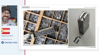
Writing began around 3400 to 500 B.C., evolving in various locations including Mesopotamia, Egypt, China, and Mexico. The early form of type included metal punches for individual characters.
00:07:12
As we moved into the 10th to 11th centuries, illuminated manuscripts became prominent. Books were handmade by monks, often elaborately illustrated and took a significant amount of time to create, primarily focusing on religious texts during this period.
00:07:32
Meanwhile, China invented woodblock printing around 220 A.D. with the Han Dynasty. Woodcut printing in Europe started around 1200, primarily through trade.
00:07:52
For instance, we see examples of colored woodcuts from the 10th century in China, contrasting with a more basic single-color print from Venice in 1511.
00:08:07
The Gutenberg Bible represented a significant development in Western typography by allowing mass production. First developing lead type, Europeans saw rapid advancements in printing technology during the 15th century.
00:08:27
By 1480, more than 110 presses had been established across Europe, leading to dramatic changes in how we thought about utilizing type for communication.
00:08:47
As we move into the 19th century, various printing styles began to flourish. While the 1800s saw the introduction of typewriters and laser printers, Apple had a substantial impact on digital typography with the rollout of the Mac.
00:09:07
The introduction of WYSIWYG interfaces in Apple's software transformed graphic design, making it easier for designers to produce work using high-quality fonts and maintaining consistent character sizing.
00:09:27
These technological advancements led us to the current realities we're dealing with today—applying typography in our digital design environments.
00:09:43
As we navigate the digital typography landscape, we need to understand that typography serves as a user interface for communicating content, whether that be stories or informational data.
00:09:56
To clarify typography, a typeface refers to a series of glyphs often defined as a font family that encapsulates multiple font styles, such as Arial and Arial Bold.
00:10:12
We can categorize typefaces into two major styles—serif and sans-serif—with both including various subtypes and less common forms.
00:10:28
Serif fonts often feature decorative strokes at the ends of their letters, making them more traditional, while sans-serif fonts exhibit a cleaner, more modern appearance.
00:10:47
Some common serif families include Venetian old style, which was prevalent in the 15th century, to the later developments with modern enhancements in typography.
00:11:06
Conversely, sans-serif fonts are more uniform in size and style, with grotesque fonts serving as a common example. Next, we will explore additional font characteristics, focusing on variations such as black letter, monospace, and others.
00:11:24
Monospace typefaces, which originated from typewriter technology, depict letters uniformly spaced regardless of their size. Today, we often rely on these styles in programming environments.
00:11:43
We can also categorize typefaces into styles that consist of pictographs, ornaments, and italicized text. Italics emerged as variations of Roman type, often used for emphasis or foreign words.
00:12:01
As we examine italic typefaces, we should note how they can differ in appearance, thereby leading to challenges in recognition and interpretation.
00:12:19
Kerning and tracking are both important to creating visual appeal in typography. Kerning focuses on the spacing between specific pairs of letters, while tracking adjusts letter spacing over a larger body of text.
00:12:37
We also need to consider font weights, which are often scaled from normal to bold within the CSS settings. Using the right weights can enhance the hierarchy of your typography.
00:12:56
Understanding font stretch can also play an important role in making some designs look more sophisticated. We need to be aware that it's better to utilize unique font styles instead of losing nuance through adjustments.
00:13:13
When working with typography in settings such as CMS or modern tools, building a systematic scale for font sizes can maintain consistency across various platforms.
00:13:31
The uniqueness of each typographic element is critical for creating a cohesive experience, particularly when designing visual interfaces that contain large volumes of text.
00:13:50
There are many factors that affect readability, including leading, measure, alignment, and margins. The medium of text and reading conditions can also impact how easily content can be consumed.
00:14:09
A general rule of thumb is to maintain an appropriate measure of text characters per line, ideally falling within a specified range depending on the typeface.
00:14:27
Using CSS properties such as max-width with the 'ch' unit can help define logically how content appears across different mediums.
00:14:43
To ensure the text appears clean and professional, the use of consistent leading and font sizes can help ensure readability while adhering to aesthetic principles.
00:15:02
Today, typography can be combined with modern design techniques, such as color schemes and white space management, to create visually engaging experiences.
00:15:22
In user interface design, it is crucial to take into consideration how people interact with text elements such as forms. The size of form fields should ideally correspond to the anticipated input length.
00:15:41
Keeping the fields appropriately sized enhances the user experience, especially in regards to ensuring that spaces are used effectively.
00:15:59
Working with paragraph styles and character styles in CSS can effectively help to manage large bodies of text, making it crucial to have clear hierarchies built into your design.
00:16:18
Tools and libraries like Bootstrap and Tailwind can simplify the understanding of typographic scales, making it easier to implement without sacrificing design quality.
00:16:37
Overall, establishing consistent typographic scales and using effective CSS practices can significantly enhance the readability and aesthetic appeal of digital designs.
00:16:56
Great references for diving deeper into typography concepts can be found in various books, showcasing effective techniques and methodologies.
00:17:13
If you're interested in typography, be sure to check out resources both online and offline, including creative examples and definitive guides.
00:17:29
I look forward to discussing these topics with you at the conference. If you have any questions, feel free to reach out to me on Discord.
00:17:46
I hope you enjoy the remainder of the conference, and I can't wait to engage with you all in person when we get that opportunity.


