00:00:20.480
All right, our next speaker is Aja Hammerly. Aja is from Seattle and is a member of Seattle.rb. She has been doing Ruby for seven years or more, and she likes dinosaurs and cats.
00:00:24.000
Today, she will be talking to us about data visualization in Ruby. Thank you, Aja.
00:00:46.800
My talk today is titled 'Seeing the Big Picture: Quick and Dirty Data Visualization with Ruby.' As Josh said, I'm Aja Hammerly. I tweet at thagomizer.rb, I'm on GitHub as thagomizer, and I blog very seldomly at thagomizer.com. I work at Substantial, a consultancy in Seattle, and we build awesome stuff. We also have an office in San Francisco, so if you'd like to know more, come talk to me after my talk.
00:00:52.079
It’s right after lunch, and I think it’s a great time for a story. The story may sound familiar, but I promise it is not based on reality. Any resemblance to real people or real companies is purely coincidental. Once upon a time, you were an internet developer who worked at a company that had a website. One of your customers calls in and says, 'Oh my God, your site is too slow! No one can use it! How can you sell this? I'm taking all my money away!' It’s a big customer, so your boss gets kind of angry and calls for a meeting in the conference room. Everyone starts panicking.
00:01:30.799
Somebody suggests, 'I know what we need to do! We need to use Java!' Another person contradicts, saying, 'No! The problem is Oracle!' While the ops guy jumps in with, 'No, we need more servers! We need 11 billion servers!' And you are just sitting there thinking, 'Wait! We don’t even know what the problem is yet!' Everyone is just throwing out solutions randomly. You might be the junior developer on the team, and others are saying, 'Trust me, I’ve been doing this for a long time.' Someone else pipes up, 'I know my cousin’s friend's grandmother’s programmer, and she said we should use COBOL.'
00:02:12.080
The meeting adjourns, and you retreat to your code cave, fuming. You start digging into the data because you know that everyone is wrong and just making wild guesses on how to solve this problem. You begin to analyze the data and figure out what the actual issue is. You run down to your boss’s cube and start presenting your findings with numbers, but your boss looks confused, maybe a bit like this.
00:02:50.480
Your boss then says, 'So we should use Java?' and you think, 'Why aren’t they understanding me?' It turns out that there is a solution: instead of just throwing numbers at people, the solution is to use pictures. For example, suppose you have a visualization of average response times. You notice suspicious spikes at 6 seconds and 12 seconds. When discussing with the ops guy, you find out that these spikes occur during backup operations, where you are backing off from your master database instead of your clone, causing slowdowns.
00:03:40.160
Having that visual helps you go back to your boss, enabling them to better understand the issue instead of just being inundated with numbers. The moral of the story is that data is proof, while hunches are not good enough. The more critical the problem is, the more essential it is to understand what's happening and to use data to support your opinions. Additionally, people naturally match patterns—we are evolved to do so—even when those patterns aren't really there.
00:04:00.720
Moreover, pictures are universal. Who here works on a team with multiple first languages? A number of hands go up. I’ve worked on several international teams, and this is where I find the value of using pictures the most. Even if everyone speaks English, during panic, brains shut down. Visually simplifying complex information can help when communicating with non-technical people or explaining to your CEO why you can't take backups from your primary database and need a secondary one.
00:04:41.600
To give a brief overview of my talk: this isn’t the focus today. Instead, we will discuss how to quickly generate visualizations using existing tools for data analysis. We will create what I call 'quick and dirty' visualizations. We'll discuss tools and techniques that will let you create visuals quickly—probably in just 10 minutes to half an hour—so that you can convey your points effectively without spending too much time designing them.
00:05:50.160
Keep in mind that I have a lot of material to cover—95 slides left. This presentation is geared towards those who write code daily and is very code-heavy—specifically for the doers in the audience. The slides and code are available on my blog, thagomizer.com, from last week's version of this presentation. This is, however, the advanced version since you are all quite skilled.
00:06:24.000
I will post the rest of the slides and code this afternoon, so if you want to follow along, feel free to do so. If you start getting lost, focus on the main ideas, and you can come talk to me later or go through the presentation later; it's pretty straightforward once you look at the code. The talk is divided into three sections: the Graph gem, Highcharts, and data extraction.
00:07:01.360
We will start with the Graph gem. The Graph gem allows you to easily create visual representations. It integrates with Graphviz, which I highly recommend using Homebrew to install for stability. Although there is a WYSIWYG editor available that Apple has been updating, it can be unstable. If you are comfortable with the command line, the Brew version is a better option and has been significantly more stable for me over the last two years.
00:07:48.640
Here are some examples of what you can make with the Graph gem. One is a graph of Ruby exceptions, showing a hierarchy of standard Ruby exceptions available in version 1.8. You can see classes, superclasses, and relationships. You can graph your Rails associations as UML-ish diagrams to visualize your application's structure. Moreover, Graph excels in depicting dependencies, similar to a curriculum layout where classes have prerequisites.
00:09:03.360
Graphviz utilizes a language called Dot, which is used to describe graphs. This language allows you to not only describe the edges and nodes but also their attributes. For visuals, you can specify colors, font sizes, or styles for nodes and edges. Tools available for viewing dot files include the previously mentioned WYSIWYG editor or alternatives like Tulip for large datasets—though not beginner-friendly. If you're an Omnigraffle user, you can also import and visualize dot files, but note that you can't edit them after importing.
00:10:17.760
The simplest graph setup in Graphviz can be created with the DiGraph method, allowing you to pass a block where you specify nodes and edges. Importantly, Graphviz automatically creates nodes based on the edges you define, simplifying the process. While you can generate dot files to save, I primarily export my graphs in various image formats—PNG, JPEG, and PDF. To export a file, simply use the save method in the Graph gem and indicate the desired file type.
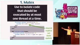
00:12:03.600
In our advanced section of Graphviz, we can add more meaning to our graphs using shapes to represent different processes and relationships. Different shapes correlate to different types of processes; for instance, diamonds might symbolize decisions. You can color-code nodes according to their significance, which makes it easier for viewers to discern differences and understand the data quickly.
00:13:27.679
When visualizing, it's crucial to focus on colors as they help in immediate recognition and understanding. The Graph gem enables you to set color schemes based on your desired intent—whether categorical, diverging, or sequential. Examples include using colors to represent different categories of data, like apples, oranges, and kumquats, in which case you'll select a categorical scheme to avoid implying any unintended relationships. I'll briefly mention Highcharts now.
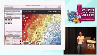
00:15:56.160
Highcharts is a tool I've used for generating various chart types, including line and bar charts, which are well-suited for visualizing the weightlifting data we discussed earlier. It is free for non-commercial use and can be integrated into web environments using JavaScript, requiring a page to render properly. When setting up Highcharts, you need to include jQuery and the Highcharts library in your project, and the process is straightforward.
00:16:53.920
To create a chart, you will first need a div where the chart will be rendered, then wrap everything in a JavaScript function. You can find the intended div element using jQuery and invoke the Highcharts method to pass in your data and settings. It’s vital to ensure your data is appropriately structured—especially when working with categorical data by using bar charts instead of line graphs for better clarity.
00:18:50.719
As you enhance your visualizations, don’t forget to label your axes and provide titles. This enhances the readability of your charts. Highcharts allows you to create a variety of charts, such as pie charts, and customize them according to your needs. It can handle multiple series and has options for adjusting axes for dual reference points, making it versatile for various data representations.
00:20:54.240
Next, we'll cover data extraction techniques. If you're dealing with HTML or XML, Nokogiri is an excellent gem for parsing data. For other forms such as JSON and CSV, Ruby provides built-in tools that can help. When working with CSV files, be cautious—parsing them with regular expressions can lead to errors unless the format is straightforward due to complexities with strings containing commas. Regex is reliable for many scenarios, making it a valuable tool.
00:22:25.679
I'll demonstrate how I built a curriculum graph based on screen-scraped data from my college's course description page. The course numbers and titles make up the graph, and to simplify the data extraction, I used Nokogiri to pull specific information matching CSS selectors. We’ll see how I processed course prerequisites and titles, and then I’ll show how these components come together in a visual format.
00:24:13.600
The process includes defining where to scrape information, normalizing the data format, and storing it in a structured collection for further analysis. The final step involves integrating the extracted data into the Graphviz module to create a visual representation of the curriculum, complete with prerequisite dependencies.